A company active in the field of flexible packaging for over 20 years wanted to update their brand identity with a logo that better represented their company and services offered. PC Packaging’s new branding includes the logo, business card and stationery and more to come to complete their already successful business and propel them into […]
Portfolio Category: Stationary
It was a great opportunity to rebrand this 40 year old company with a fresh new look. Dinasa’s new branding includes logo, business card & stationery, outdoor banner to use on construction sites & window signage. Thus complementing their already successful legacy and propelling them into the future.
Manufacturer of raw meats for cats and dogs. Startup business needing logo, business card and stationery. Playing on the “Versace” trim and incorporating regal dog and cat to give the logo a prestigious look and to reflect their premium quality meats for pets.
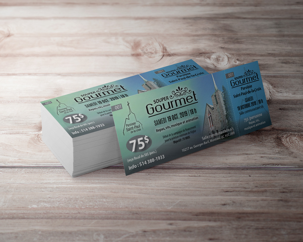
Organization of a dinner for a fundraising campaign and the church needed tickets for their event. Creation of logotype, ticket and card of remeriement.
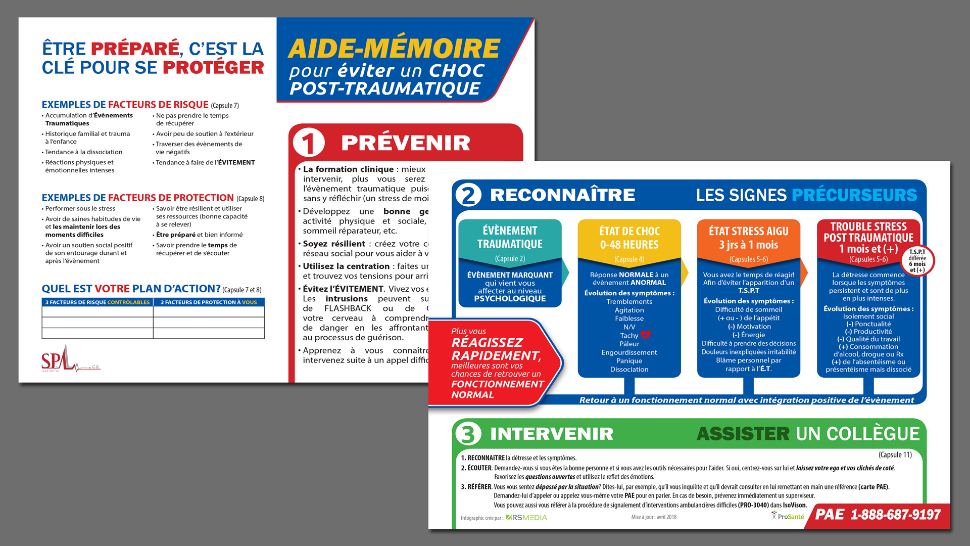
They wanted to create a go to checklist for ambulance technicians can carry with them on the job in order to avoid traumatic shock during certain emergency situations. Key symptoms and steps to follow needed to be clear and be able to grab their attention in order to be quickly identified by the technician in […]
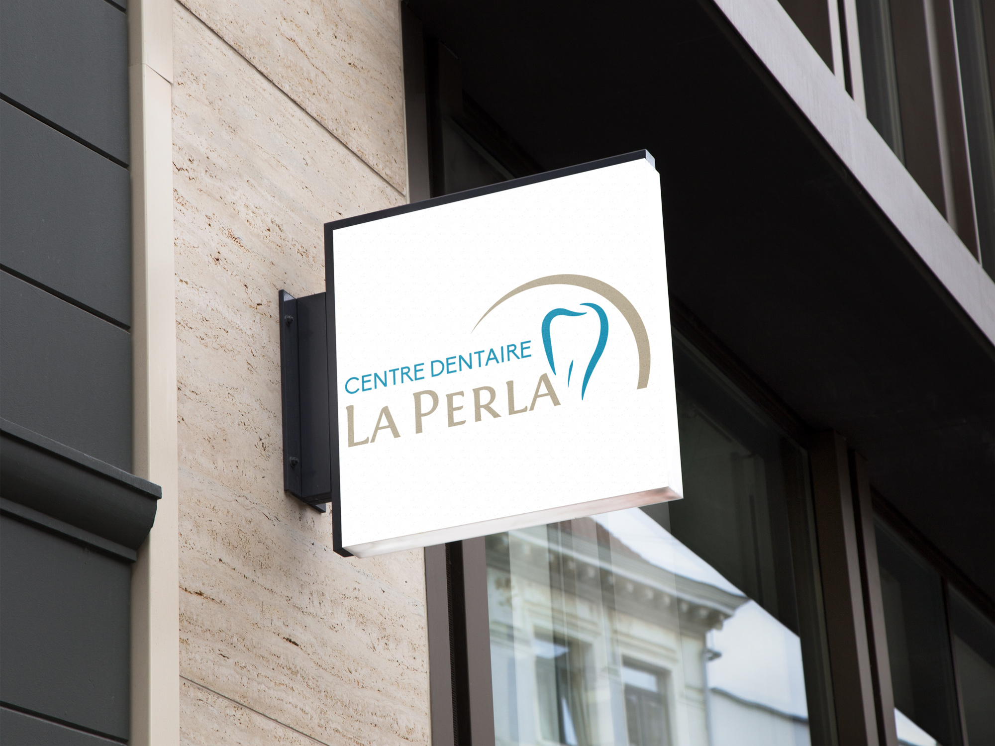
When Dr James C. Tucci decided to open his own dental clinic and venture off on his own, I was entrusted to design the branding for his new clinic. The main idea behind the logo was to somehow integrate a pearl in my design. “La Perla” meaning “the pearl”. The gold arch represents a pearl […]
Under a new administration, Foltige asked that I redo the logo in order to modernize it and make it more design, knowing that their main activity was the landscaping of gardens.
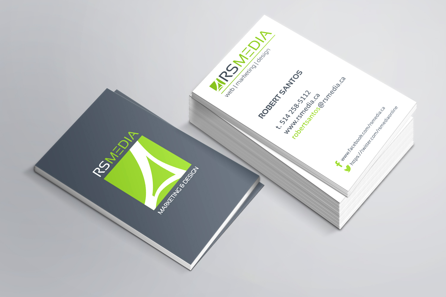
Marketing, web and design agency from the east end of Montreal had to update its logo and business card. Given that the agency is in the east end of Montreal, I framed a symbol that resembles the Olympic Stadium to show who are located near the stadium and often people associate the stadium with the […]
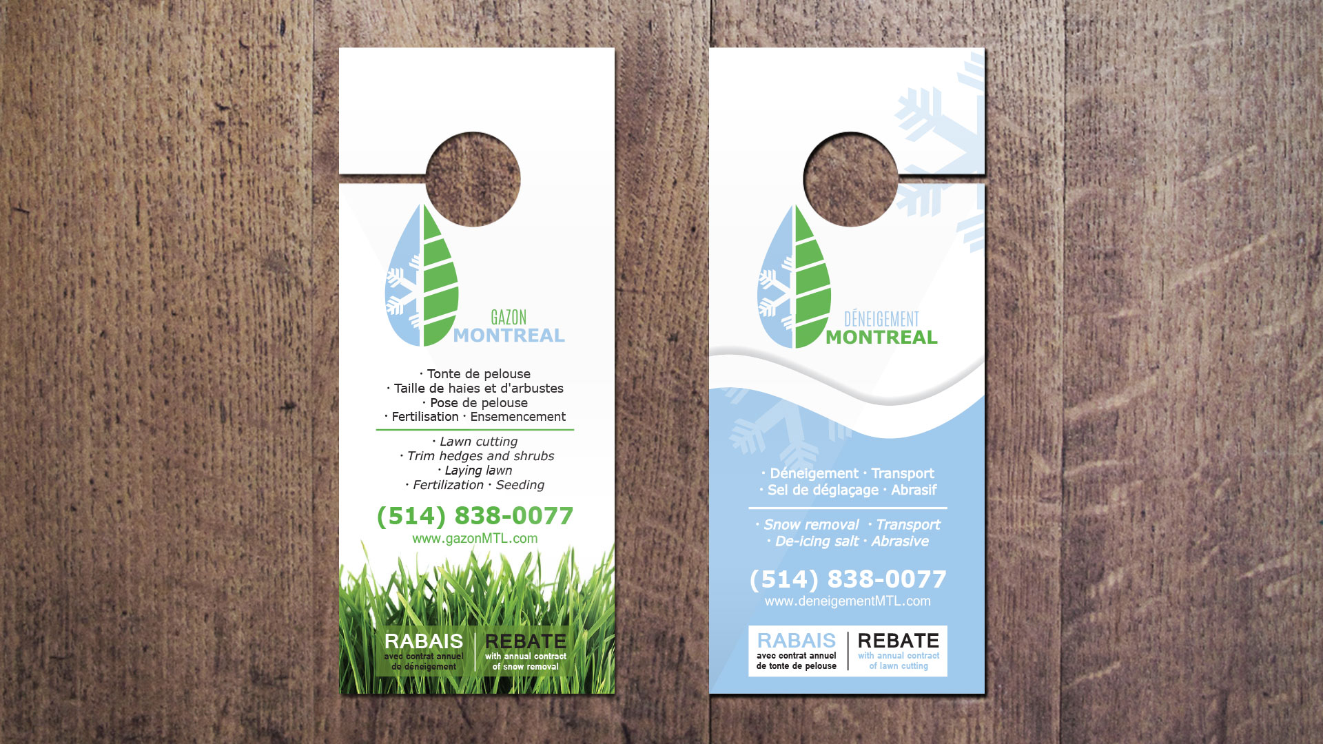
Paysagiste by summer (green side) and snow removal (blue side) by winter. This logo created clearly represents both services offered by this one company. They wanted to keep the same image but two separate texts in order to use one for the summer and the other for the winter. Their business card and marketing material […]


