


About the project
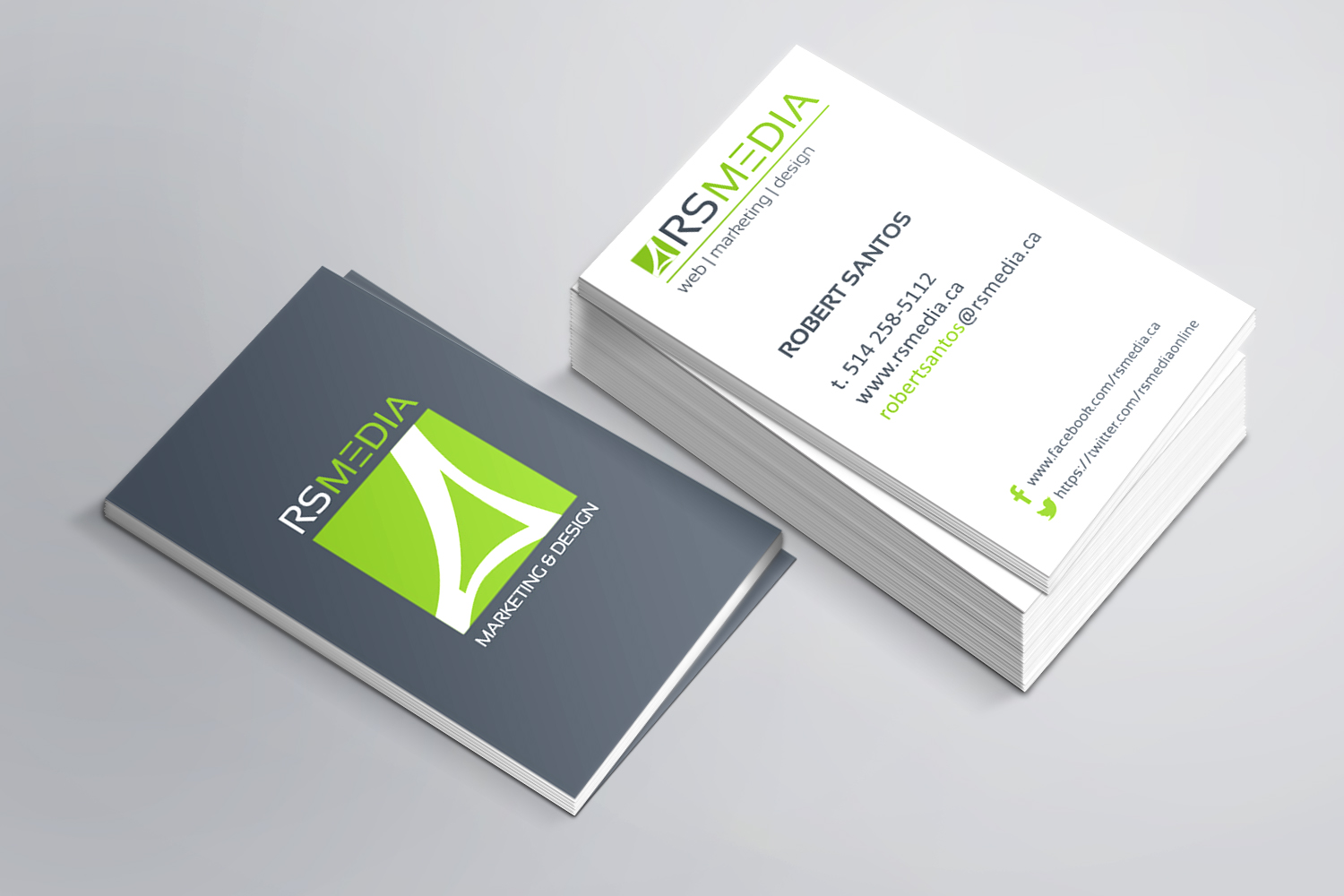
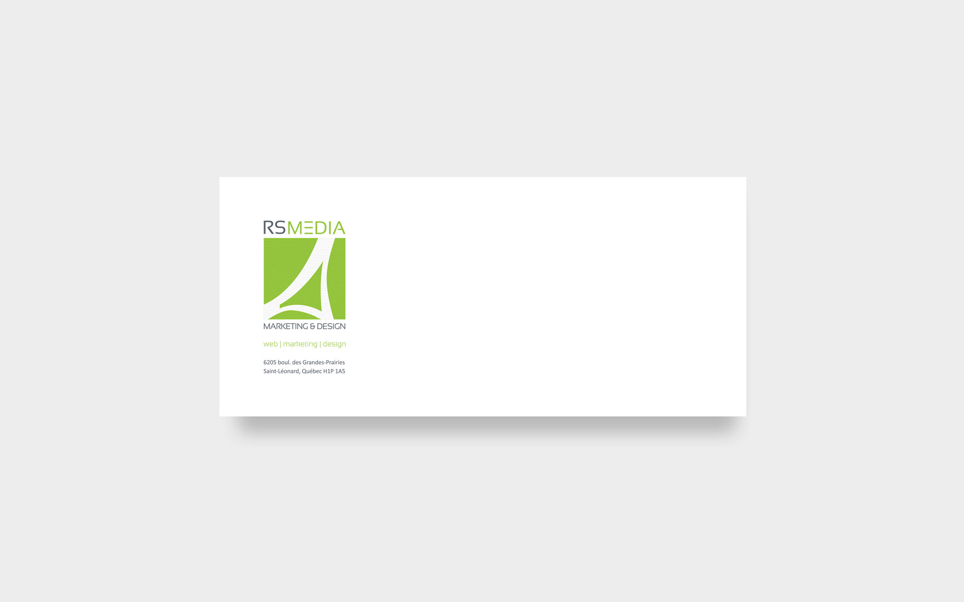
 Marketing, web and design agency from the east end of Montreal had to update its logo and business card. Given that the agency is in the east end of Montreal, I framed a symbol that resembles the Olympic Stadium to show who are located near the stadium and often people associate the stadium with the east of Montreal. I used a modern font with the “E” which represents the 3 lines of a “hamburger menu” on a website, since the website represents a large part of their work.