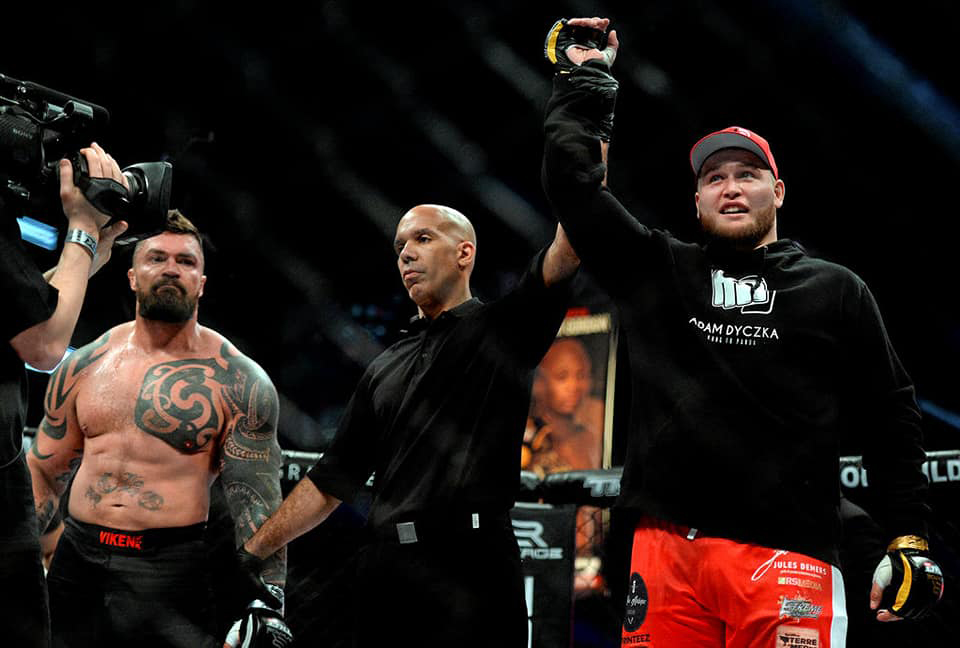
Fighter in the MMA, Adam Dyczka, was gaining more and more popularity on the professional scene and needed a more professional and marketable image. Nicknamed the “Kung-Fu Panda” of mixed martial arts because of his posture and the power of his right. When designing his logo, I had the idea to take a fist and […]
Portfolio Category: Corporate identity
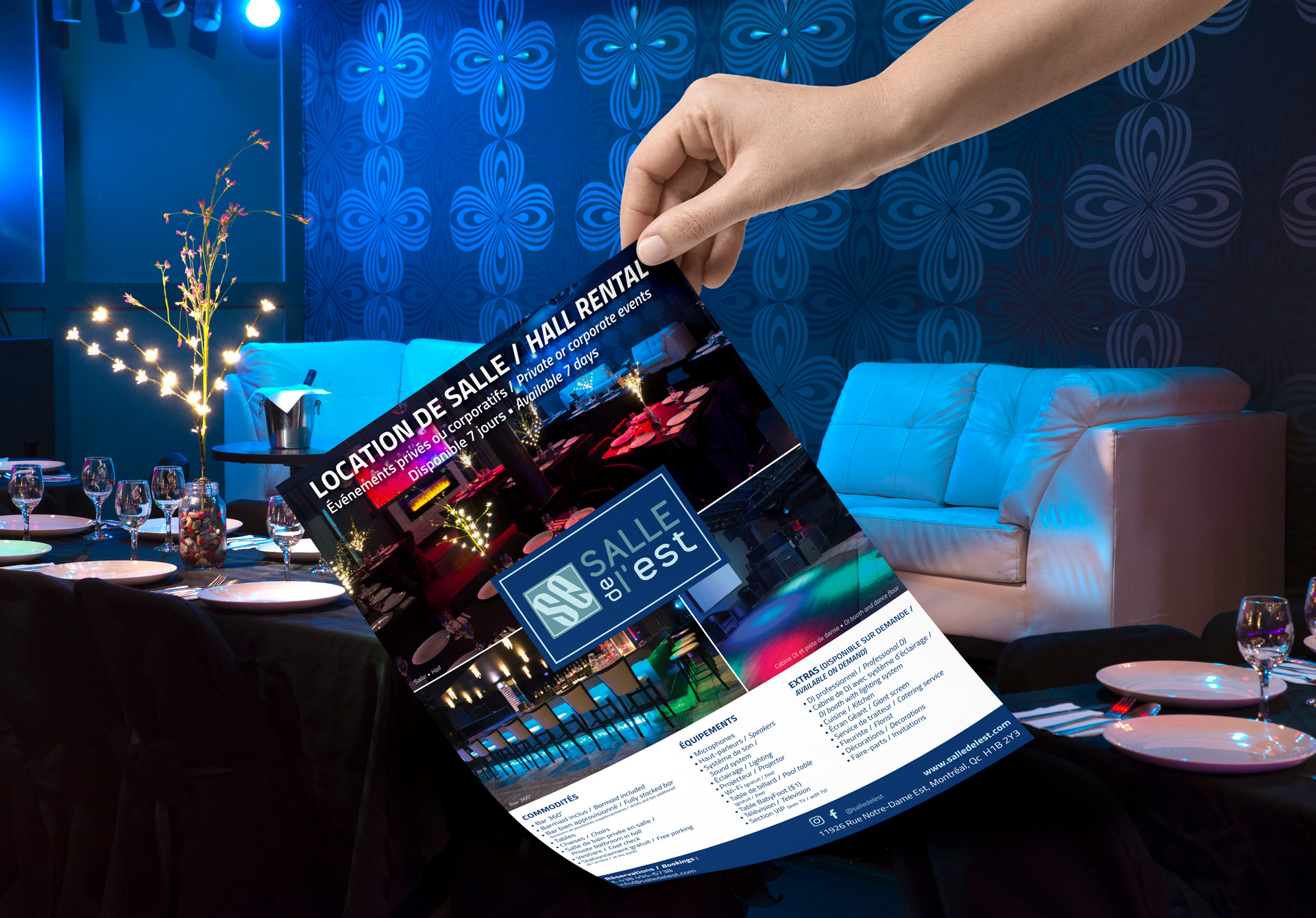
Reception Hall needed a presentation book of all services offered to show potential customers what they get when they book a room for their event. It also serves as a reference guide for their staff when they have to meet a client. Logo, business card and flyer created.
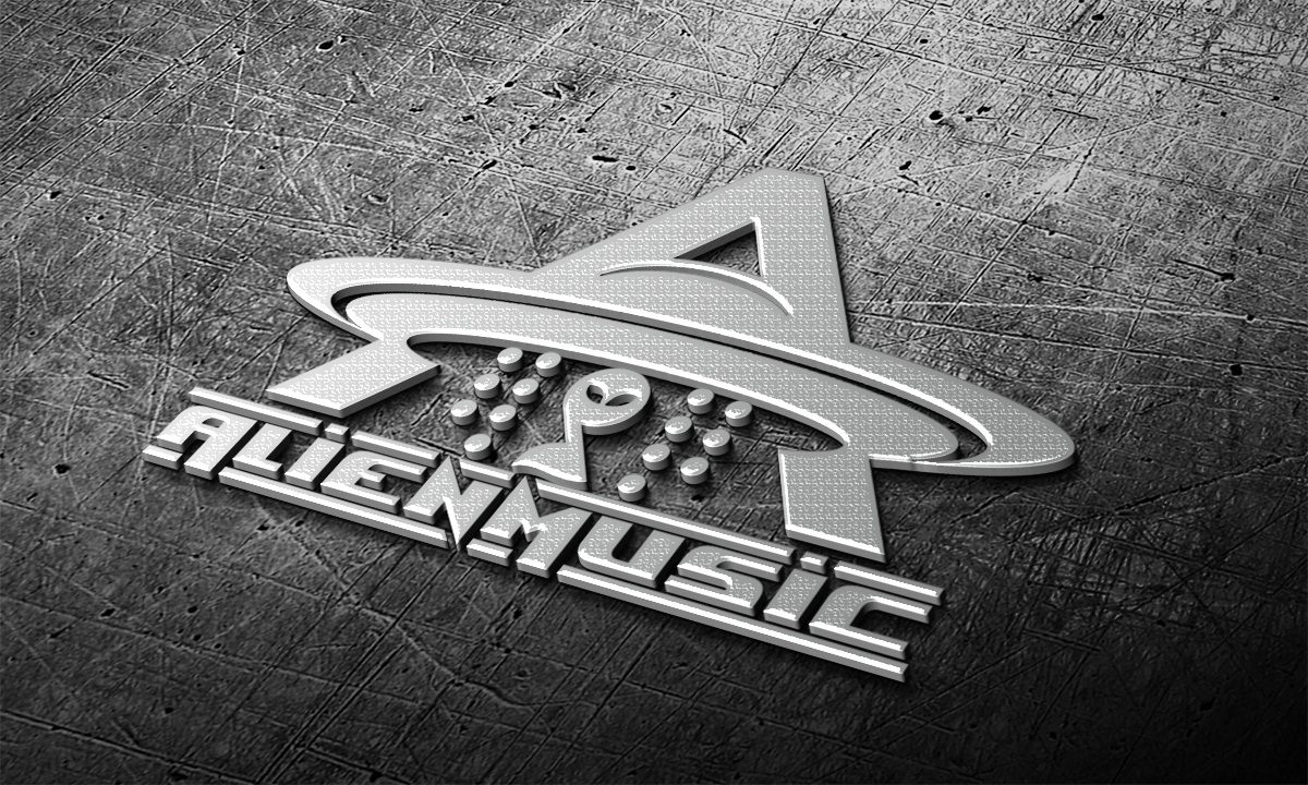
Record company specializing in “underground” Latin music, non-commercial. The concept of the logo was to represent his name “Alien Music”. So I integrated an extraterrestrial that is sucked into an “A” shaped spacecraft for “Alien” and with a circular shape representing a vinyl record.
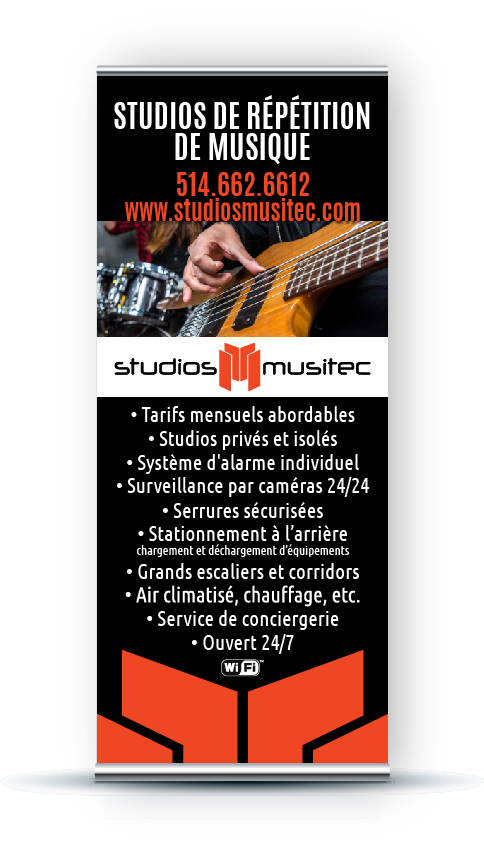
Studios that can accommodate musicians or a dance group looking to rehearse for their next show or individuals needing to do a presentation or give a conference. They needed a logo and a few marketing materials in order to attract their target audience. Because they needed a logo that is diversified and they have over […]
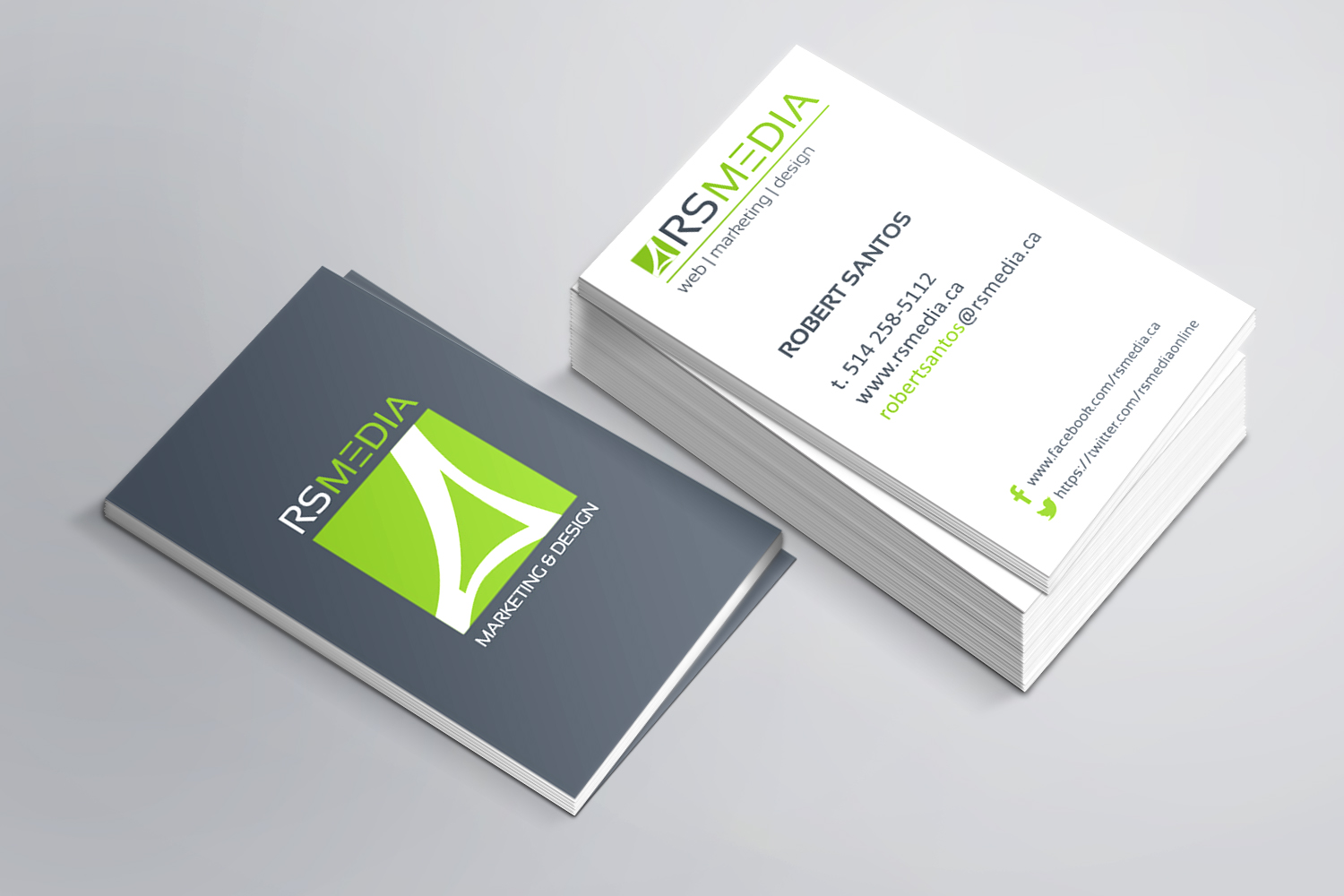
Marketing, web and design agency from the east end of Montreal had to update its logo and business card. Given that the agency is in the east end of Montreal, I framed a symbol that resembles the Olympic Stadium to show who are located near the stadium and often people associate the stadium with the […]
I was mandated to rebrand in order to reflect their new store concept and mission. The store has been in existence for more than 40 years and specializes in natural products. They originally contacted me a few years back to create an online store in order to increase sales. I partnered with Rsmedia to create […]
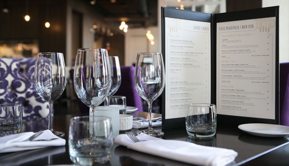
New high end restaurant in Griffintown needed a look that would match the sophistication of it’s interior. I created a sleek modern logotype, a custom business card, and custom menus that would bring back the paisley and purple of their interior decor.
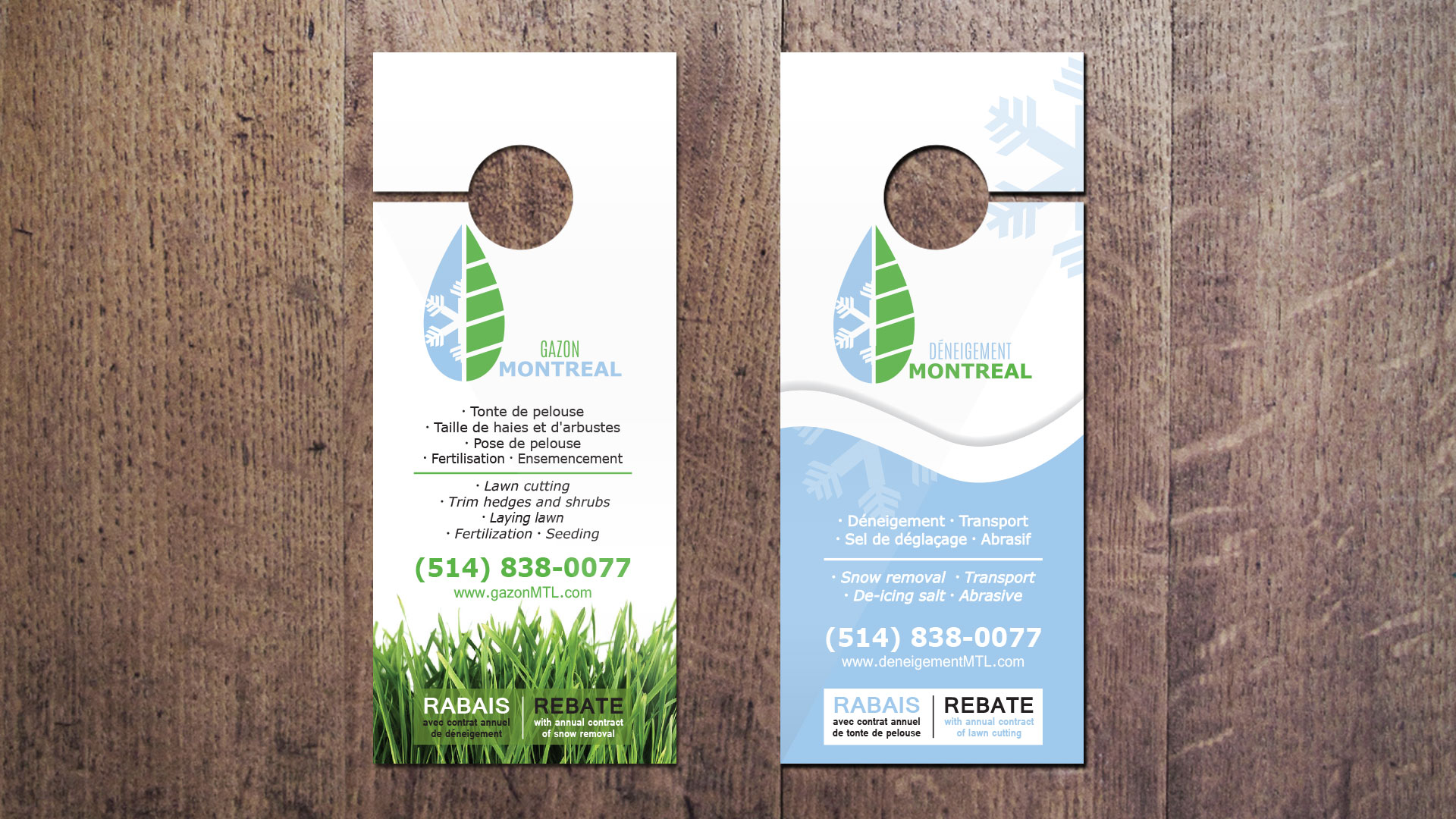
Paysagiste by summer (green side) and snow removal (blue side) by winter. This logo created clearly represents both services offered by this one company. They wanted to keep the same image but two separate texts in order to use one for the summer and the other for the winter. Their business card and marketing material […]
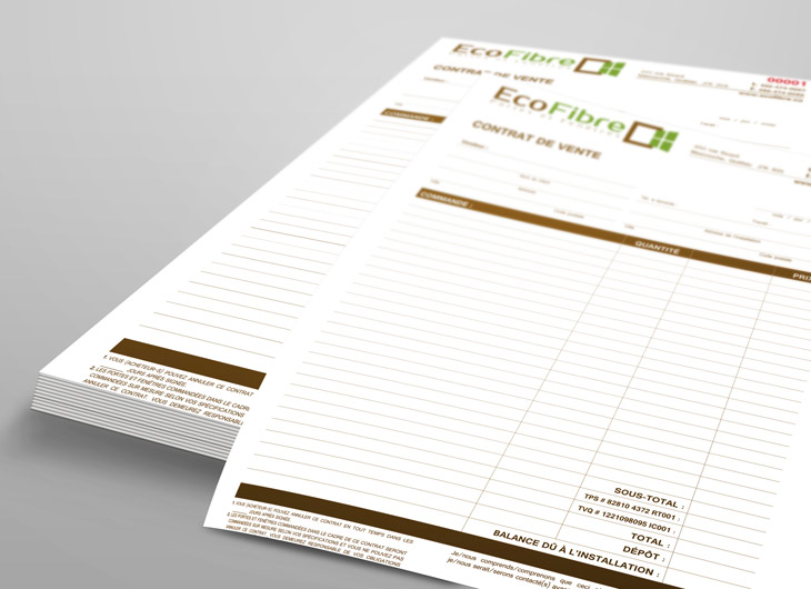
Window and door company specializing in eco-friendly fiber glass windows and doors needed everything from logo design to stationary to presentation folders, estimate and invoice (NCR) forms, etc. for their start-up. I chose green and brown for their colors in order to emphasize the company’s environmentally friendly products and a square to represent a window […]

