Personal martial arts trainer and fitness expert needed a logo in order to identify herself as a private trainer.
Portfolio Category: Logo
Company specializing in residential and commercial counter tops and flooring made out of various colored agragates, which is called terrazo. They needed a new logo that would allow them to enter the residential market.
A Montreal company specializing in terrazo flooring and countertops needed a logo to develop its business and services abroad. The 3 spots of different colors represent the aggregates used to make their product and can also be interpreted as different continents at the international level.
When Dr James C. Tucci decided to open his own dental clinic and venture off on his own, I was entrusted to design the branding for his new clinic. The main idea behind the logo was to somehow integrate a pearl in my design. “La Perla” meaning “the pearl”. The gold arch represents a pearl […]
Beauty bar located in Place Alexis Nihon specializes in eyebrow threading and eye lash extensions. Client wanted a bohemian feel, yet modern and classy in order to compliment her very plush looking salon. I created an eye that would represent her main service offered and that’s where I was able to incorporate a bohemian aspect […]
Company in the field of construction that specializes in residential and commercial renovations. The logo includes the initials of both partners and the different size buildings demonstrates that project size may vary depending on the client and depending on whether it is residential or commercial.
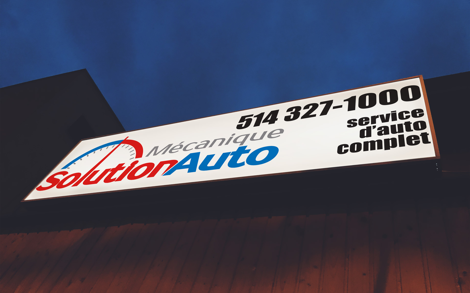
Mike Gergis has been in business for over 20 years. After all these years of activity, Mike had never had a logo created for his auto mechanic shop. When his outdoor signage was in desperate need of rethinking, he decided it was time to create a logo at the same time. As a general mechanics […]
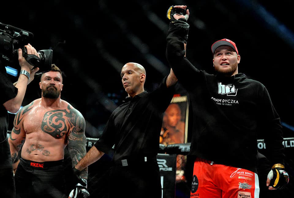
Fighter in the MMA, Adam Dyczka, was gaining more and more popularity on the professional scene and needed a more professional and marketable image. Nicknamed the “Kung-Fu Panda” of mixed martial arts because of his posture and the power of his right. When designing his logo, I had the idea to take a fist and […]
Under a new administration, Foltige asked that I redo the logo in order to modernize it and make it more design, knowing that their main activity was the landscaping of gardens.
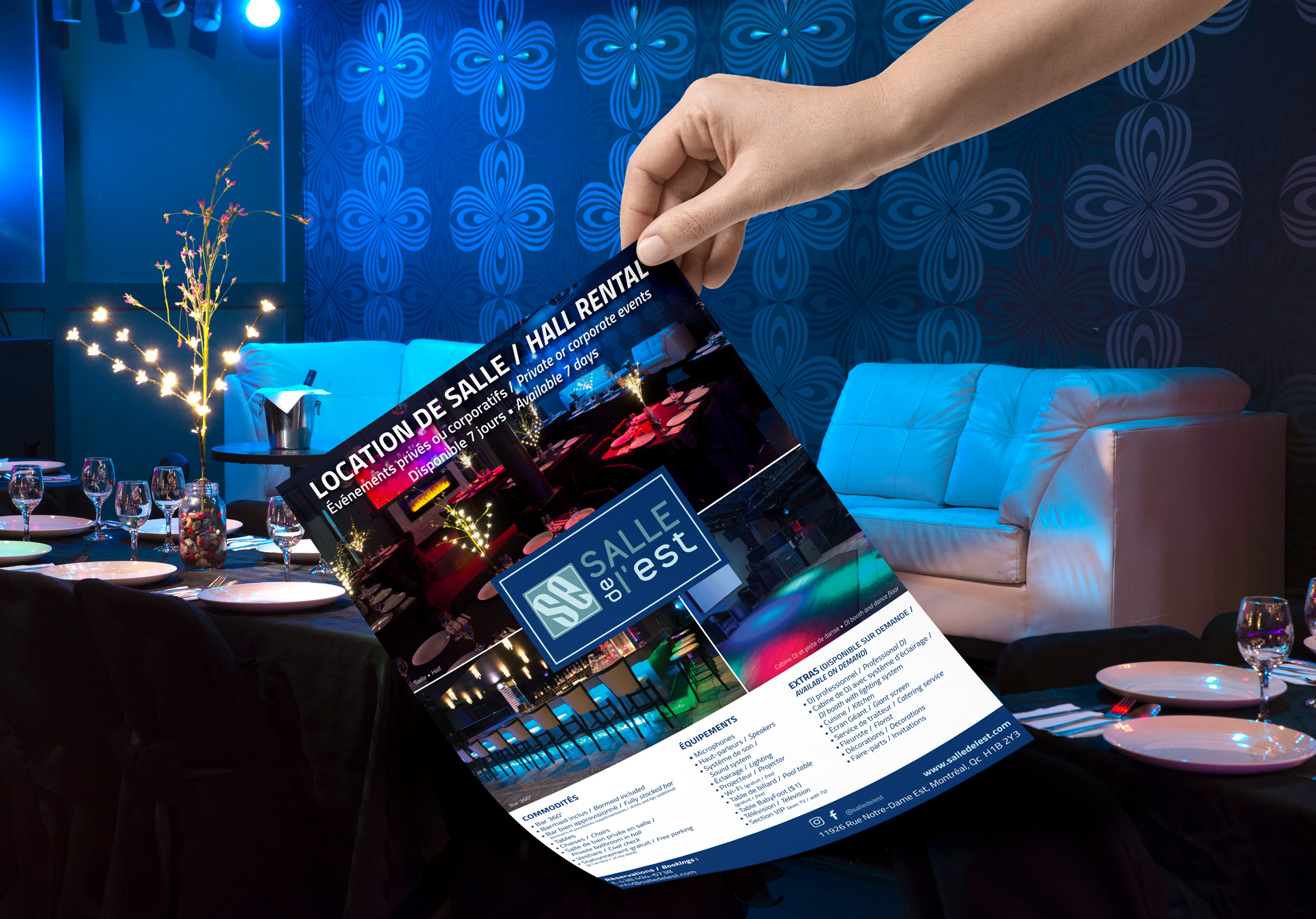
Reception Hall needed a presentation book of all services offered to show potential customers what they get when they book a room for their event. It also serves as a reference guide for their staff when they have to meet a client. Logo, business card and flyer created.

